Hello!
We have a really fun Less is More challenge for you this week where we are looking for you to incorporate the colours of your kitchen in to your CAS design. My kitchen is white with green walls and dark wood floor so that was my starting point.
Here I used a strip of wood patterned paper down the edge and teamed it with a very old stamp from Hero Arts which I inked in a couple of shades of green. I combined it with a simple sentiment from Altenew.
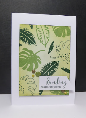
Next up my card is not quite so CAS but I couldn't resist the temptation to have another play with the fab new stamps from Uniko:
I lightly inked a panel and stamped the glorious tropical leaves in a range of greens and combined with a Uniko sentiment. The June release from Uniko may be small but it is super cool - do check it out if you haven't already!
I ran out of time to make anything more this week but am really looking forward to seeing how your kitchen colours inspire your cards. Check out the colour schemes that the fab DT have used over at Less is More :)
Less is More is being sponsored by Happy Little Stampers this month.
Thanks as always for stopping by!
Sarah x


Just CAS gorgeousness as ever Sarah! Love all the white space on the first one and I've also had to play with the paradise sets again for this challenge. Superb use of those tropical leaves. Have a good week x
ReplyDeleteJust CAS gorgeousness as ever Sarah! Love all the white space on the first one and I've also had to play with the paradise sets again for this challenge. Superb use of those tropical leaves. Have a good week x
ReplyDeleteOh, how fab are those tropical leaves? Funnily enough, I was looking at them online this morning and umming and ahhing... your lush card pushes them right up the priority list! Love your first card too with its lovely clean feel and typeface sentiment :)
ReplyDeletelove your cards Sarah and what a fun idea for a challenge!
ReplyDeleteGreat Lim card xx Jan
ReplyDeleteThat first card has a definite oriental feel about it with the beautiful leaf frond and the fabulous minimal CAS design Sarah. Truely beautiful. The stamp set you used on the second card is so yummy and the greens look so fresh.
ReplyDeleteSharon xx
Green is my favorite color! Just love these stunning cards!
ReplyDeleteboth cards are amazing!
ReplyDeleteWHat gorgeous greens Sarah, both cards are superb, but the first one has the edge for me!
ReplyDeleteChrissie xx
Two very different cards, Sarah. One is soft and serene and the other bright and whimsical. It shows your versatility and I love them both.
ReplyDeleteTwo lovely cards. Although the second one is not quite so CAS, I think it's my favourite. I love all the different shades of green. xx
ReplyDeleteSorry for the late visit, this week has been completely bonkers!
ReplyDeleteTwo wonderful cards, I adore the first one, that foliage stamp looks beautiful with the lovely white space xx